
Abrus Krishna Finance: A Trust-First UI/UX Design for a Regulated Gold Loan Company
How Teknoppy designed a trust-first visual system for abruskrishna.com on WordPress (Elementor) that visually separates nine loan products, gives KML compliance first-class prominence, and maps out a transparent four-step borrower journey.
AT A GLANCE
About Abrus Krishna Finance
Abrus Krishna Finance is a Kerala Money-Lenders Act (KML) registered lending institution based in Guruvayoor, Thrissur district, offering gold loans, doorstep gold loans, and a range of micro business, personal, home, and consumer goods loans across nine dedicated product pages.
Design work for a regulated lender carries a different weight than design for most local businesses. A borrower isn't just deciding whether they like how a page looks — they're deciding, often in seconds, whether an unfamiliar business can be trusted with gold or personal documents. That decision happens visually before it happens on the page's content, which is what made this UI/UX brief distinct from a typical redesign.
This case study covers UI/UX design work specifically. For the full site build — content, structure, and development — see the separate WordPress Development case study for this client.
The Challenge
Content and structure alone don't build trust for a regulated lender — how the page actually looks and feels matters just as much to a first-time borrower deciding whether to hand over gold or personal documents.
No visual distinction between loan products
Without deliberate design, nine loan types risked visually blending together, making it hard for a borrower to quickly identify the right page for their need at a glance, before reading a single word of copy.
No visual prominence for compliance and trust signals
KML registration and regulatory information weren't given any visual weight, despite being exactly what a cautious borrower looks for first when deciding whether to trust a lender with gold or personal documents.
No visual guide through the borrower journey
The loan process wasn't presented as a clear visual flow, leaving first-time borrowers uncertain what to expect — or how long it would take — before they ever applied.
Generic, templated visual language
Typography, color, and layout didn't read as a serious, regulated financial business — the kind of visual restraint and clarity a lender needs to look credible was missing, replaced by generic template styling that could belong to any small business site.
Not designed mobile-first
Most first-time borrowers researching a local gold loan branch do it from a phone, often while nearby or between errands. A design that treats mobile as an afterthought loses exactly the borrower it needs to convert.
Project Objective
Teknoppy's brief was to design a UI/UX that could:
Let borrowers quickly tell nine distinct loan products apart, by sight, not just by heading text
Make regulatory trust visually prominent rather than buried in body copy
Guide first-time borrowers through the loan process with a clear visual flow
Establish a visual language that reads as a serious, regulated lending business
Work mobile-first, since most borrowers would encounter the site on a phone first
Our Approach
How Teknoppy crafted a trust-first visual system, distinct product styling, and mobile ergonomics:
Distinct visual treatment per loan category
Rather than styling all nine loan pages identically, Gold Loan, Business Loan, and Micro Finance product groups were given a consistent but visually distinguishable treatment — shared layout patterns so the site still feels like one brand, but different enough per category that a borrower scanning the menu can tell at a glance which group matches their need, before reading a single line of copy.
Trust and compliance made visually prominent
KML registration and compliance information were treated as first-class visual elements — given their own dedicated page with clear visual hierarchy, rather than sitting as a paragraph competing with everything else on the page. For a regulated lender, what a borrower notices first often decides whether they read any further at all.
A visual four-step process
Contact/Visit → Document Verification → Approval → Disbursement was designed as a clear visual flow on the homepage rather than a block of text, giving first-time borrowers an immediate mental model of what to expect before they ever pick up the phone.
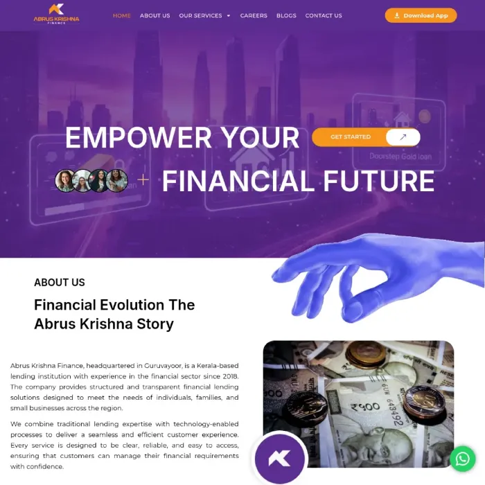
A visual language suited to a regulated business
Typography, color, and layout choices were made to reflect the seriousness of a regulated lending business rather than generic template styling. Restraint matters here — a financial brand that looks overly promotional or visually noisy undermines the same trust the content is trying to build.
Designed mobile-first, not adapted afterward
Because most first-time borrowers encounter a local lender through a phone search rather than a desktop visit, layout, tap targets, and visual hierarchy were designed for mobile first, then scaled up — not the reverse. This also matters for how Google evaluates the site: mobile usability has been part of core ranking signals for years, and a design that's merely "responsive" rather than mobile-first often shows the gap in exactly the moments that matter, like filling out a loan enquiry on a small screen.
Color and iconography chosen to match the business, not a template default
A gold loan business carries an obvious visual association most template designs ignore in favour of generic blue-and-white corporate styling. Warmer, restrained gold and neutral tones were used deliberately — consistent enough to feel intentional rather than decorative, and paired with simple, literal iconography for each loan category rather than abstract stock-style icons that force a borrower to guess what a symbol means. Small decisions like this add up to a site that feels like it was built specifically for a gold loan company, not adapted from a generic business template.
What We Delivered
Distinct visual treatment per loan category.
Gold Loan, Business Loan, and Micro Finance product groups use a consistent but visually distinguishable design, so a borrower can tell at a glance which page matches their need.
Trust and compliance made visually prominent.
KML registration and compliance information are treated as first-class visual elements on their own dedicated page, not buried in body copy.
A visual four-step process.
Contact/Visit → Document Verification → Approval → Disbursement is designed as a clear visual flow on the homepage, giving first-time borrowers a mental model before they apply.
A visual language suited to a regulated business.
Typography, color, and layout choices reflect the seriousness of a regulated lending business rather than generic template styling.
A mobile-first layout.
Tap targets, spacing, and visual hierarchy were built for how a first-time borrower actually browses — on a phone, often quickly — rather than adapted from a desktop design after the fact.
A color and iconography system matched to the business.
Restrained gold and neutral tones paired with literal, easy-to-read iconography per loan category, replacing generic template styling with a visual identity that reads as purpose-built.
Why Visual Design Matters for a Regulated Lender's E-E-A-T
E-E-A-T isn't only a content property — it's a page-quality property, and visual design is part of how a page communicates quality. A cautious borrower deciding whether to trust a lender with their gold or personal documents forms that judgment within seconds, often before reading a single sentence. Cluttered layouts, inconsistent styling, or a generic template look undercut even the most accurate compliance content sitting right below it.
This matters for search engines too, not just human visitors. Google's page experience signals — mobile usability, visual stability, clear navigation — sit alongside content quality in how a YMYL page like a lending site gets evaluated. A borrower-friendly visual hierarchy and a mobile-first layout aren't just design preferences; they're part of the same trust signal that well-structured compliance content builds on the content side.
There's also a semantic and entity dimension to visual consistency that's easy to overlook. When the same color, iconography, and layout pattern repeat consistently for "Gold Loan" across every touchpoint — the homepage, the product page, the compliance page — it reinforces Gold Loan as a single, coherent entity in a way that inconsistent styling undermines, even if the text content is identical. Visual consistency and content consistency are doing the same entity-building work from two different directions.
Frequently Asked Questions
Designing an interface that lets borrowers quickly distinguish between nine loan products while making regulatory trust visually clear for a first-time visitor, on both mobile and desktop.
Written by Sanal Edison, Digital Strategist at Teknoppy.
Need a design that builds instant trust and makes complex options easy to navigate?
TEKNOPPY.COM • KOCHI, KERALA