
Varma Ayurveda: Designing a Calm, Trust-First UI/UX for an Unfamiliar Healing Practice
How Teknoppy crafted a calm, trust-first UI/UX system for varmaayurveda.com that holds up across four languages, guides first-time visitors through unfamiliar Ayurvedic treatments, and matches a hotel-based booking model at Hotel Stadt Breisach, Germany.
AT A GLANCE
About Varma Ayurveda
Varma Ayurveda is an Ayurvedic wellness retreat run by Dr. Dona George inside Hotel Stadt Breisach in Breisach am Rhein, Germany, offering authentic South Indian Panchakarma and Varma (Marma) therapy to a European audience.
Design for a wellness retreat like this carries a specific challenge: the visitor isn't evaluating a product they already understand, they're deciding whether to trust an unfamiliar healing practice with their body and their holiday. That decision is shaped by how calm and considered the site feels, long before a visitor reads the details of any single treatment.
This case study covers UI/UX design work specifically. For the full site build — content, structure, and development — see the separate WordPress Development case study for this client.
The Challenge
Good treatment content alone doesn't make an unfamiliar therapy feel approachable — how the page is laid out and paced matters just as much to a first-time visitor.
No visual hierarchy for an unfamiliar decision
Treatments, philosophy, and booking competed for attention without a design system guiding first-time visitors step by step through an unfamiliar therapy, leaving them to piece together what mattered most on their own.
No design system built for multilingual expansion
Layouts and UI components weren't planned around how German, French, and Italian text runs longer than English, risking broken buttons and cramped labels once the same page existed in four languages.
No calm, wellness-appropriate visual language
Without a deliberate color palette, typography, and imagery style suited to a healing practice, the design risked feeling generic rather than reassuring to someone considering an unfamiliar treatment at a hotel they'd never visited.
No visual structure for ten treatments
With Common Ayurveda and specialized Varma Chikitsa programs sitting without a consistent page pattern, an already unfamiliar therapy system risked feeling dense and hard to compare rather than approachable.
Not designed mobile-first
Many visitors research wellness travel from a phone — comparing retreats, reading reviews, browsing photos — before ever reaching a desktop. A design that treats mobile as secondary loses exactly the browsing behaviour this kind of visitor actually has.
Project Objective
Teknoppy's brief was to design a UI/UX that could:
Guide first-time visitors calmly through unfamiliar treatment information, step by step
Hold its layout across German, French, Italian, and Spanish, where text runs longer than English
Organize ten treatments under one consistent, easy-to-compare visual structure
Support a guided, low-friction booking flow suited to a hotel-based retreat
Work mobile-first, for visitors researching wellness travel primarily from a phone
Our Approach
How Teknoppy crafted the calm visual hierarchy, multilingual layout flexibility, and guided booking flow:
A calm, trust-building visual design system
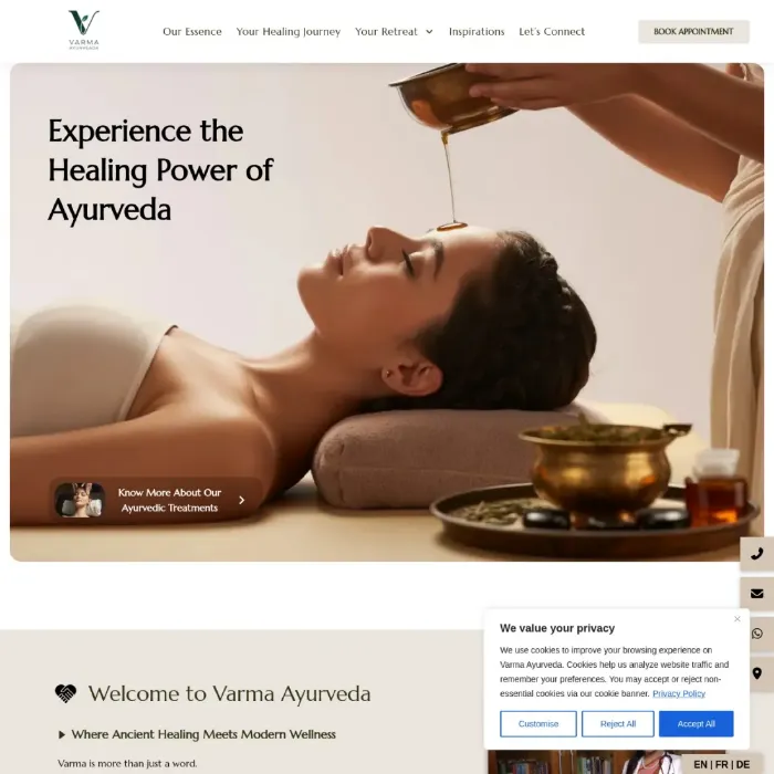
Wellness-appropriate typography, imagery, and a restrained color palette were used to guide visitors through unfamiliar treatment content step by step rather than overwhelming them with everything at once. For a first-time visitor deciding whether to trust an unfamiliar healing practice, a calm, uncluttered layout does real persuasive work before a single sentence of copy is read.
Color and imagery choices leaned toward warm, earthy tones and natural photography rather than the bright, clinical look many wellness sites default to. Ayurveda is a nature-rooted practice, and a visual language that echoes that — rather than borrowing the sterile aesthetic of a medical clinic — matches what a visitor is actually looking for when they search for this kind of retreat in the first place.
A design system built to flex across four languages
UI components, buttons, and labels were designed with enough flexibility to hold their layout across Spanish, German, French, and Italian, where text length varies significantly from the English source — a German compound word can run noticeably longer than its English equivalent, and a button or navigation label that fits in English can break or wrap awkwardly once translated. Planning for that variation upfront avoided the cramped, broken-looking components that a design built only around English text tends to produce once it expands into other languages.
Ten treatments organized under one visual structure
Common Ayurveda and specialized Varma Chikitsa programs were laid out under a consistent "Your Retreat" page pattern, so an unfamiliar therapy system feels navigable and comparable rather than dense. Repeating the same visual pattern across all ten treatment pages also means a visitor who understands one page immediately knows how to read the next.
A guided, low-friction booking flow
The appointment form's fields — room type, arrival and departure dates, number of guests, and treatment program — are sequenced and styled to feel like a single simple step, matching the retreat's hotel-based delivery model rather than presenting as a generic enquiry form bolted onto a wellness site.
Designed mobile-first for how wellness travel is actually researched
Wellness travel decisions are typically researched in short sessions on a phone — comparing a retreat against other options, reading treatment pages, checking photos — often before a visitor ever sits down at a desktop to book. Layout, spacing, and tap targets were designed mobile-first so that browsing experience holds up, rather than treating mobile as a scaled-down afterthought of a desktop design.
What We Delivered
A calm, trust-building visual design system.
Wellness-appropriate typography, warm earthy imagery, and a restrained color palette guide visitors through unfamiliar treatment content step by step rather than overwhelming them, reinforcing the retreat's credibility before a visitor reads a word.
A design system built to flex across four languages.
UI components, buttons, and labels hold their layout across Spanish, German, French, and Italian, where text length varies significantly from the English source.
Ten treatments organized under one visual structure.
Common Ayurveda and specialized Varma Chikitsa programs are laid out under a consistent "Your Retreat" page pattern, so an unfamiliar therapy system feels navigable rather than dense.
A guided, low-friction booking flow.
The appointment form's fields are sequenced and styled to feel like a simple step, matching the retreat's hotel-based delivery model rather than a generic enquiry form.
A mobile-first layout.
Spacing, tap targets, and visual pacing were built for how wellness travel is actually researched — in short sessions on a phone — rather than adapted from a desktop design afterward.
Why Calm, Consistent Design Matters for Health & Wellness E-E-A-T
Ayurveda and wellness therapy content sits in the same higher-scrutiny territory as other health-adjacent topics, and that scrutiny isn't only about the words on the page. A visitor deciding whether to trust an unfamiliar healing practice reads calm, clear design as a form of credibility — and reads clutter, inconsistency, or generic styling as a reason for doubt, often before they've read a single treatment description.
This also carries a semantic and entity dimension worth naming. When the same visual pattern — layout, color, iconography — repeats consistently for "Varma therapy" or "Panchakarma" across every language version of the site, it reinforces those as single, coherent entities that happen to be described in four languages, rather than four separate, disconnected experiences. Visual consistency and multilingual content accuracy are doing the same entity-building work from two different directions. Mobile usability and page experience also sit alongside content quality in how Google evaluates a page like this, so a calm, mobile-first layout is reinforcing the same trust signal the treatment content builds on its own.
Frequently Asked Questions
Designing an interface calm and clear enough to guide a European audience through an unfamiliar healing practice, while holding up visually across four languages and a hotel-based booking flow.
Written by Sanal Edison, Digital Strategist at Teknoppy.
Need a design that helps visitors feel calm and confident about something unfamiliar?
TEKNOPPY.COM • KOCHI, KERALA